RHINO Piling
Case Study

”We couldn’t be happier with our new logo. It’s a bold, premium, minimal and versatile design that makes an impact wherever it’s seen. It oozes professionalism, reliability and expertise, sets exactly the right kind of expectations for all kinds of customers, and gives us legs to expand.
DavidMarketing Director, Rhino Piling
The challenge
Rhino Piling provides piling and engineering solutions to the domestic and commercial building sectors.
Even as a relatively new company, founded in 2018, Rhino felt its brand did not successfully represent the quality of services and values of the business. We were challenged to come up with an identity, website and graphics to engage with their target market and excite the audience.

The solution
Rebrand
We worked with Rhino Piling to understand the target audience across both domestic and commercial sectors. We wanted to create an identity that was as strong as the service being provided. A gesture to the importance of foundations and piling. The previous logo was a cartoon rhino and although it was clear that this did not represent the business, we were encouraged to bring the rhino animal idea into the new logo.
The new logo is made up of a heavy-weight type with a rhino silhouette within the negative space of the ‘R’. The colour palette was created to reflect the high-vis clothing associated with the industry.


Website
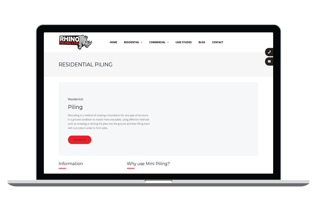
The old website was text-heavy and lacking in imagery. This resulted in the audience not fully understanding the service available. There was very little to inspire or engage with the audience and therefore conversion was poor.
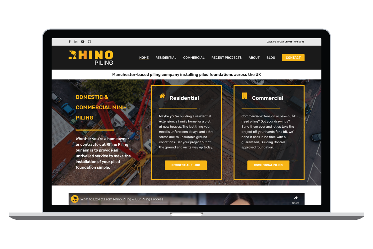
The new website reflects the brand and business successfully, also working to engage the audience through emotive imagery, informative content and consistent call-to-actions. An explainer video now offers the user a quick and simple way to understand the services.
Graphics
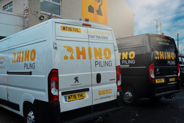
From signage to uniform, it was important to get the new identity seen and set a tone for the business. This was delivered by creating powerful and consistent graphics across the business so that the audience receive a singular visual representation.
We worked closely with the team at Rhino to understand the new brand and how to use it along with imagery and style representations. This has allowed the team to produce some amazing videos, capturing the brand and it’s people – check out the videos and you’ll see what we mean!
We also produced branded clothing and signage for Rhino for a complete and unified identity. Thanks to the extra large logo sign above the new offices, the building is now known locally as ‘The Rhino Building’, it’s all about brand recognition!
The results
The result is a brand that not just looks great but truly represents the nature of the business, its services and values. Consistent and concise branded materials have meant that Rhino is now a visible and highly regarded company in its sectors. A website that now converts visitors into paying customers has resulted in the business growing and expanding into additional, complimentary services.
”After a couple of meetings to determine exactly what we wanted, the team at Let's Grow got to work and delivered the perfect design just a few weeks later. No revisions were needed, they knocked it out of the park the first time and we were blown away.
BradManaging Director, Rhino Piling


